
Overview
Tag component is a visual label used to highlight, or display status information in your application. This article explains how to configure and utilize Tag components.
.png&w=1080&q=75)
.png)
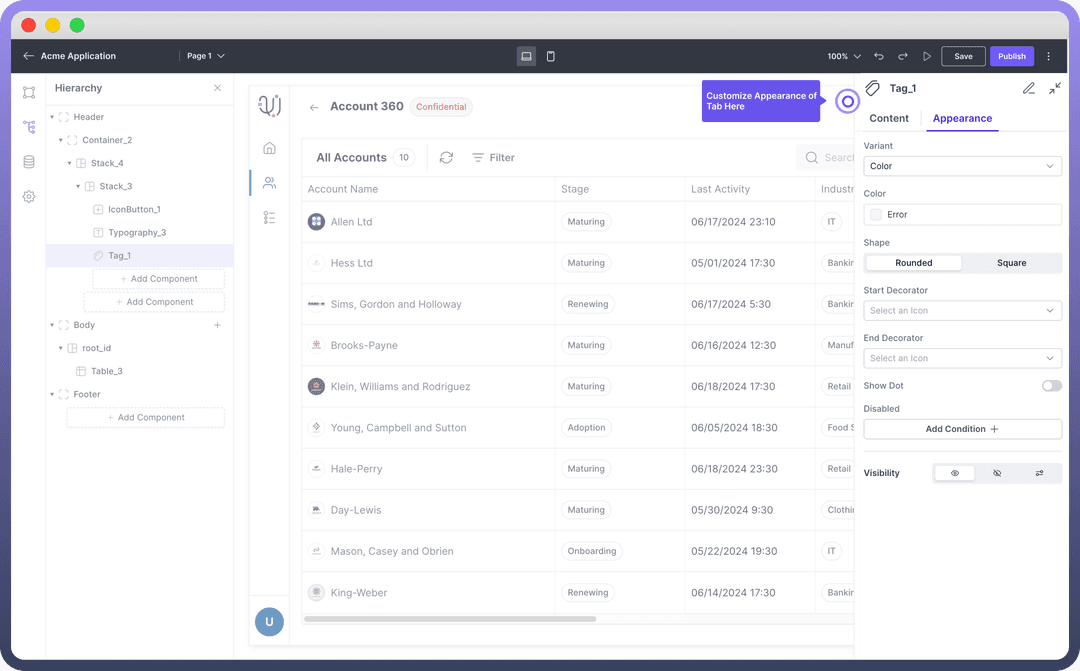
Key Properties
After adding a Tag component to your design, customize it using the properties panel on the right side of the interface.
Set Label: Enter the text to be displayed within the tag.

Note
You can use the data pills from the input data tab while configuring the text to be shown. This can be used to update the data dynamically.
Appearance Customization
Customize the Tag's appearance to match your application's design:
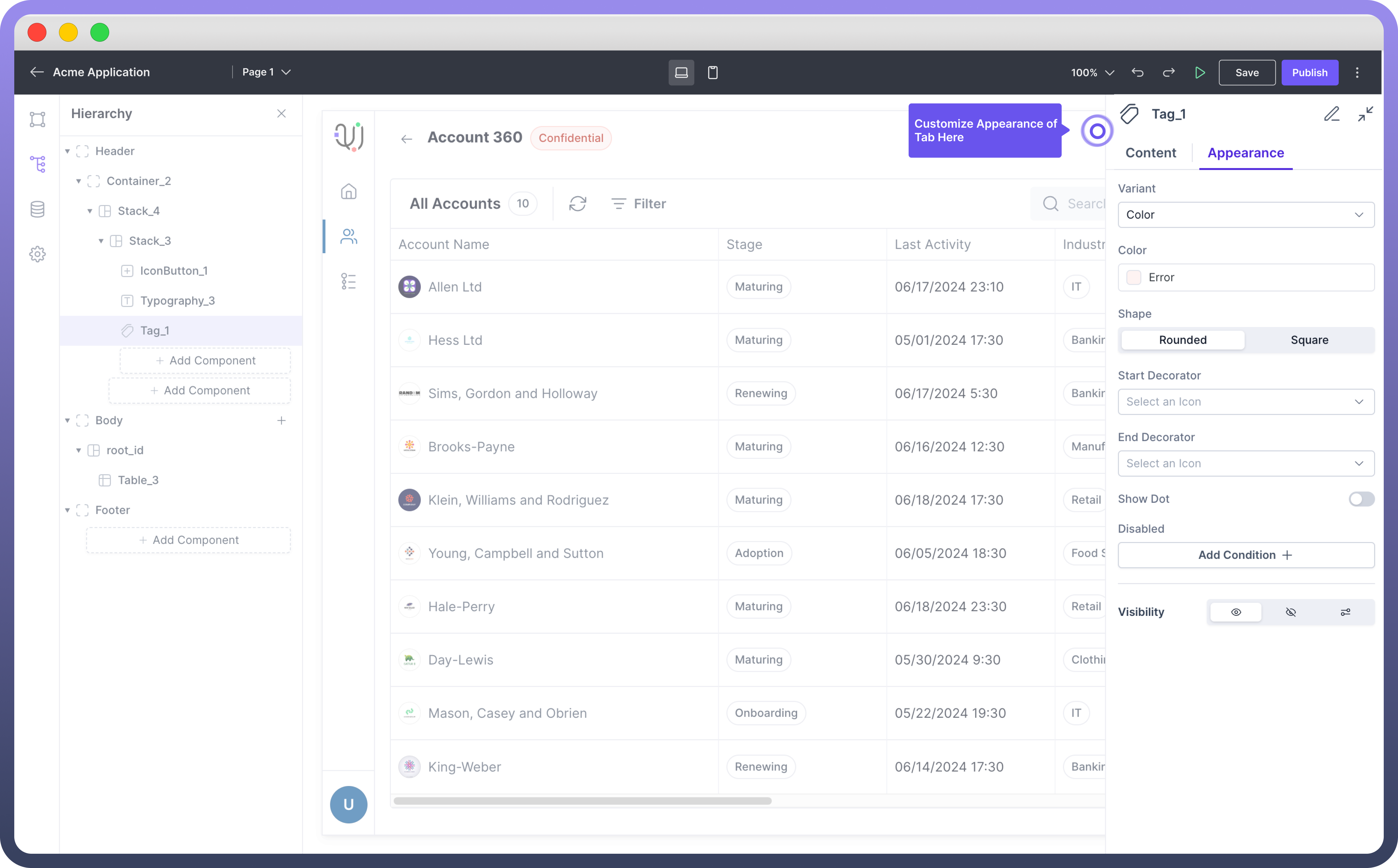
| Property | Description |
Variant | Select the variant style for the tag (e.g., Color, Clear - No Colour) |
Color | Choose the color scheme for the tag. |
Shape | Select between Rounded or Square corners |
Start Decorator | Add an optional icon at the beginning of the tag |
End Decorator | Add an optional icon at the end of the tag |
Show Dot | Toggle to display a dot indicator on the tag |
Disabled | Set conditions to disable the tag |
Visibility | Control the tag's visibility (visible, hidden, or conditional) |
Define Interactions
Set up interactions for when users click or interact with the tag:
Navigate to the "
Interactions" section in the properties panel.Click "
Add Interaction".Choose the type of interaction (e.g., filter data, trigger action, show modal).
Configure the specific details of the chosen interaction.
Refer
Refer to the Interactions article for more detailed information on setting up various types of interactions.
Best Practices
Consistency: Use tag styles consistently for similar types of information across your application.
Clarity: Keep tag text concise and clear to ensure readability.
Color Usage: Use colors meaningfully to convey information or status.