Contents

Cancel

Recommended Articles

  1. unify-apps

    Indexing

    Unify AI

    Transform raw content into searchable knowledge through AI-powered indexing and vector embeddings

  2. unify-apps

    Snowflake as Destination

    Unify Data

    Load and transform your data seamlessly into Snowflake's cloud data warehouse with UnifyApps' native connectivity and flexible staging options.

  3. unify-apps

    Quentn

    Unify Integrations

    Integrate your app with Quentn to automate marketing campaigns, manage contacts, and optimize customer engagement.

  4. unify-apps

    Connector SDK

    Platform Tools

    Create custom connectors within the Unify platform to unify workflows

  5. unify-apps

    JobNimbus

    Unify Integrations

    Integrate your application with JobNimbus to manage leads, track jobs, and streamline your workflow processes efficiently

  6. unify-apps

    IMAP

    Unify Integrations

    Integrate your app with IMAP to enable seamless email synchronization, real-time access, and enhanced communication workflows.

  7. unify-apps

    Basin

    Unify Integrations

    Basin transforms form handling from a backend headache into a simple integration—capture submissions, trigger automations, and manage data flows without touching server code, giving you more time to build what matters

  8. unify-apps

    Preview Your Work

    Unify Automations

    Effortlessly review & monitor your automation’s performance

  9. unify-apps

    QuickBooks

    Unify Integrations

    Integrate your app with QuickBooks to streamline accounting, automate invoicing, and manage finances effortlessly

  10. unify-apps

    FTP/FTPS

    Unify Integrations

    Connect your app with FTP/FTPS to automate secure file transfers and streamline data exchange across systems.

  11. unify-apps

    Data-Sync by Avoid Duplicate Operations Setting

    Unify Data

    Prevent infinite loops in bidirectional data synchronization by creating record hashes that ensure one-way data flow across connected systems.

  12. unify-apps

    Filters

    Unify Applications

    Enable users to refine, search, and sort data effortlessly across dashboards and datasets

  13. unify-apps

    Insided

    Unify Integrations

    Integrate your app with Insided to enhance customer engagement, streamline community management, and drive self-service support.

  14. unify-apps

    Reverse Polling

    Unify Data

    Reverse Polling technique efficiently retrieves recent data from APIs that return results in chronological order (oldest first), optimizing pagination and data processing strategies when working with time-ordered data sources.

  15. unify-apps

    Facebook Ads

    Unify Integrations

    Connect your app with Facebook Ads to automate campaign management, optimize ad performance, and track marketing success.

  16. unify-apps

    Duplicate Field

    Unify Integrations

    Create independent copies of your data fields to enable multiple mappings while preserving original values for validation and complex workflows.

  17. unify-apps

    Gainsight

    Unify Integrations

    Integrate your app with Gainsight to enhance customer success, automate engagement workflows, and drive retention

  18. unify-apps

    Simplesat

    Unify Integrations

    Integrate your app with Simplesat to collect real-time customer feedback, measure satisfaction, and improve service quality.

  19. unify-apps

    Livestorm

    Unify Integrations

    Integrate your app with Livestorm to streamline webinar hosting, automate event management, and enhance audience engagement.

  20. unify-apps

    Application Connectors

    Unify Data

    Instantly leverage 30+ pre-built application connectors to extract, transform, and load your business-critical data between systems with UnifyApps' no-code integration platform.

Unify Applications
Logo
Add Components to your Interface
Logo
Button Group

Button Group

Logo

3 mins READ

Overview

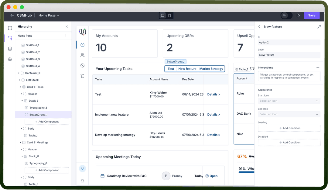
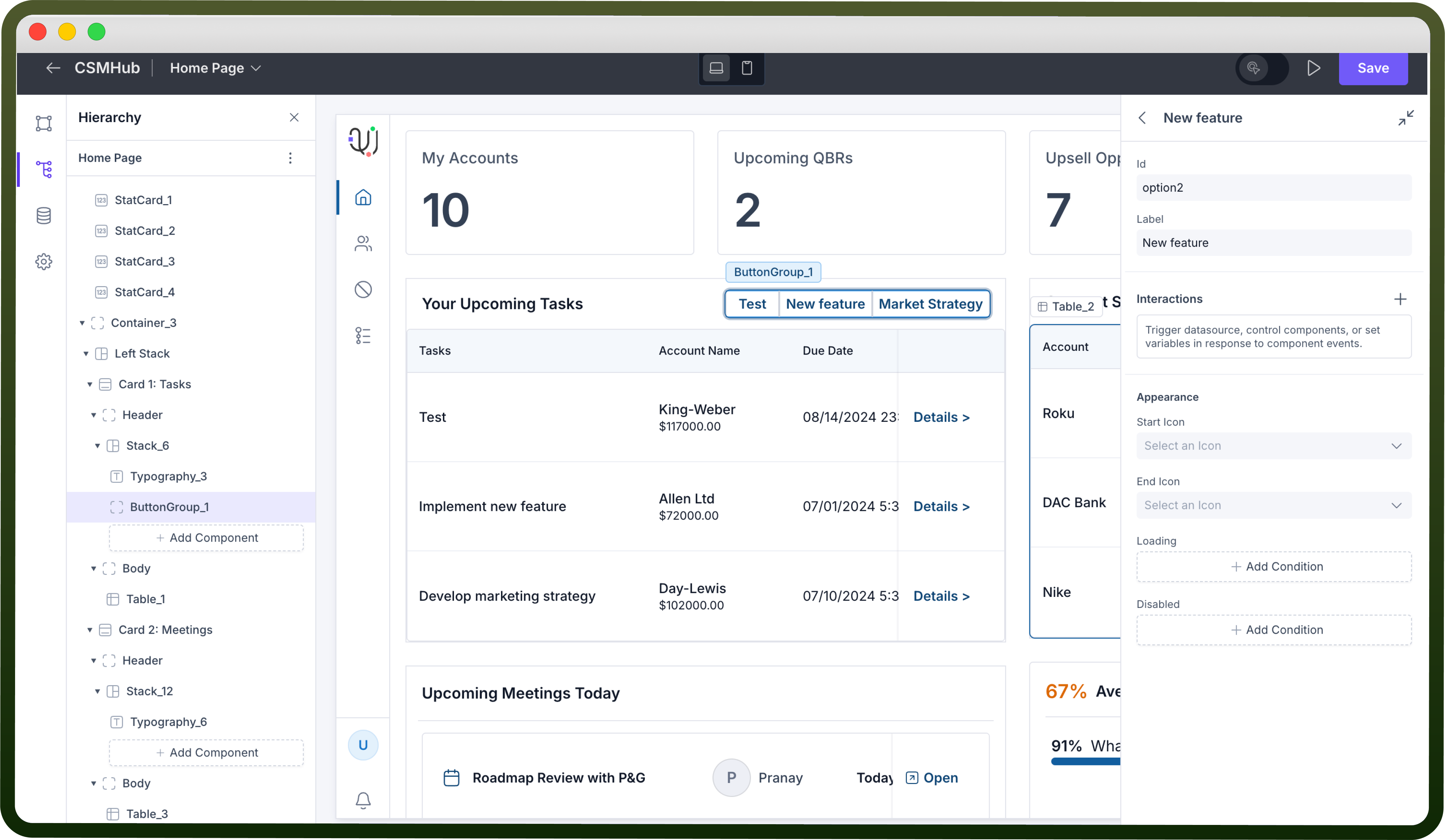
The Button Group is an interactive component that lets users perform multiple actions through a set of buttons. It allows users to trigger different actions, navigate to other pages, redirect to URLs, and interact with various data sources within the application.

Image
Image

Key Properties

Once the Button Group component is added to the canvas, you can configure it with the following key actions:

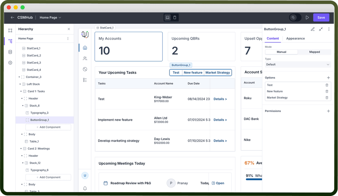
  1. Mode: There are two modes for Button Groups—Manual and Mapped.

    • Manual: You can manually add buttons by adding slots under Options.

    • Mapped: Map an array of objects either manually or through a data source, where each object in the array will generate a separate button.

  2. Type: There are 2 types of button group — Default and Dropdown.

    • Default: Buttons appear side-by-side in a row.

    • Dropdown: Buttons are displayed in a dropdown list when the Button Group is clicked.

  3. Label of a Button: Enter the text for each button in the “Label” field. This is the text that will appear on each button.

  4. Interactions on Each Button: Specify the interactions that should occur when a button is clicked. Click the “+” button under "Interactions" to add actions such as triggering a data source, navigating to another page, and more.

    Thumbnail

    Refer

    You can refer to interactions article to know more about setting up event handlers in your application.

    Image
    Image

Add Loading State

The Loading State option lets you show that a process is in progress after the button is clicked. 

This is helpful for actions that take time to complete, like submitting a form or fetching data from an API. The button will stay in this loading state until the action finishes.

Conditional Display

Control the button group’s availability and visibility based on specific conditions in the "Disabled" and "Visibility" sections.

  • Disabled: Use this option to make the button non-interactive based on certain conditions. For instance, disable the button if a required field is left empty. To set this, click “Add Condition” in the Disabled section and define the criteria.

    Thumbnail

    Refer

    You can refer to Visibility condition article for configuring Visibility conditions for any component in your application.

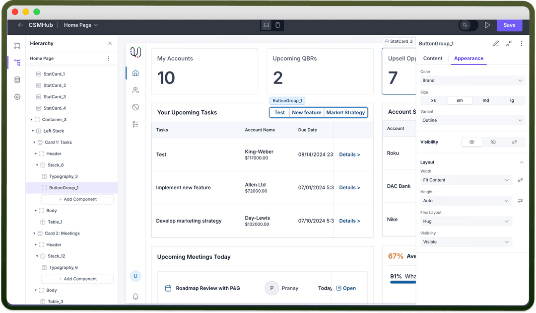
Customizing the Appearance

Use the appearance settings to align the look and functionality of the button group component to fit your application’s needs.

  • Color: Select a color from the “Color” dropdown. Available options include brand colors, neutral (black), or danger (red).

  • Size: Pick the button size from options: small (sm), medium (md), or large (lg).

  • Variant: Choose the button style from options like Solid (with background fill), Outline (border only), or Ghost (text-only).

  • Visibility: Set visibility controls to display or hide the component based on conditions or user roles, enabling a more interactive experience.

    Image
    Image

Defining Permissions

Each component supports visibility permissions based on the logged-in user’s permissions. This ensures only authorized users can see and interact with the component.

Thumbnail

Refer

You can refer to Permissions article for the same.