
Overview
The Avatar Group component provides a visual representation of multiple users or entities in a compact, organized display. It allows you to showcase a collection of avatars with customizable appearance and behavior. Avatar Groups can display both static lists of avatars or dynamically mapped data from your application sources, making them perfect for team displays, user lists, and collaborative interfaces.
Key Properties
Type Selection
The Avatar Group offers two primary configuration types:
Mapped: Connects to dynamic data sources to populate avatars automatically
Static: Manually configured avatars with fixed properties
Avatar Representation
Each avatar within the group can be customized with:
Icon or Image: Choose between symbolic icons or actual images
Avatar ID: A unique identifier for each avatar in the group
Fallback Text: Alternative text displayed when images fail to load
Appearance Controls
Size: Multiple size options from xxs to 2xl to fit your design needs
Max Visible Avatars: Control how many avatars are visible at once
Layout: Customize the arrangement and spacing of avatars
Background: Set custom background colors and styles
Border: Apply border styling to visually separate avatars
Configuring an Avatar Group
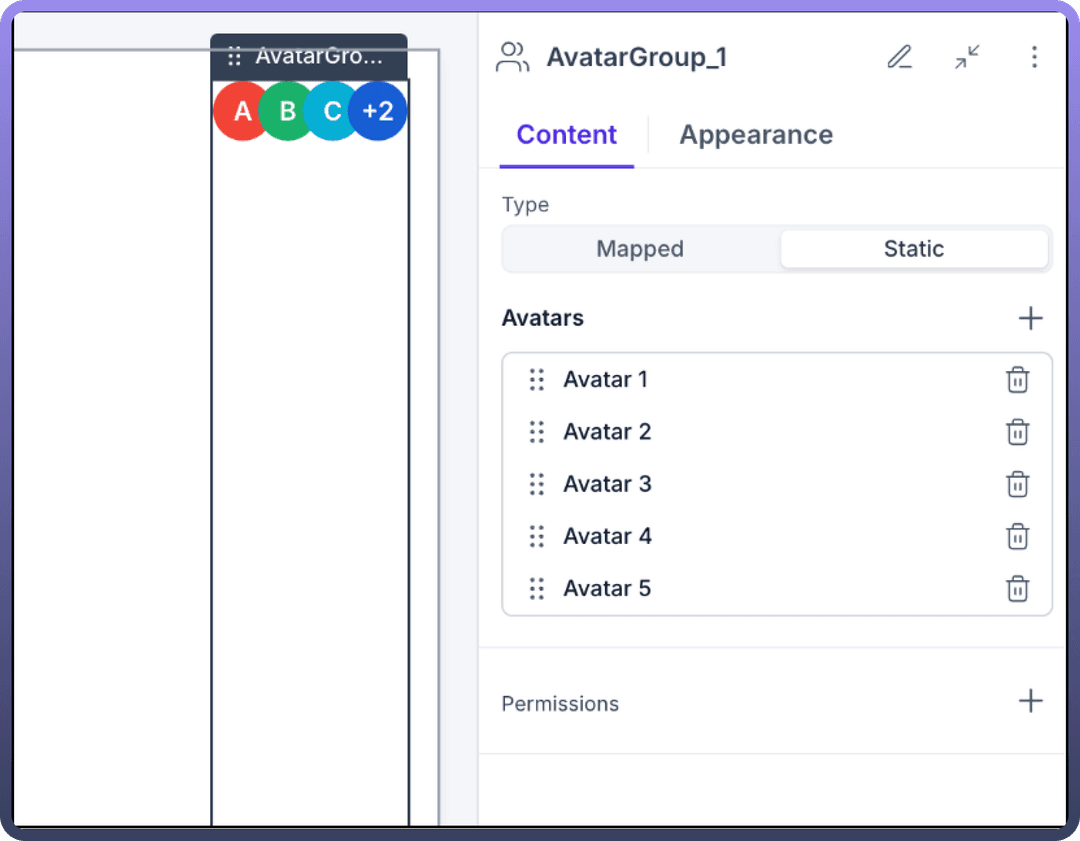
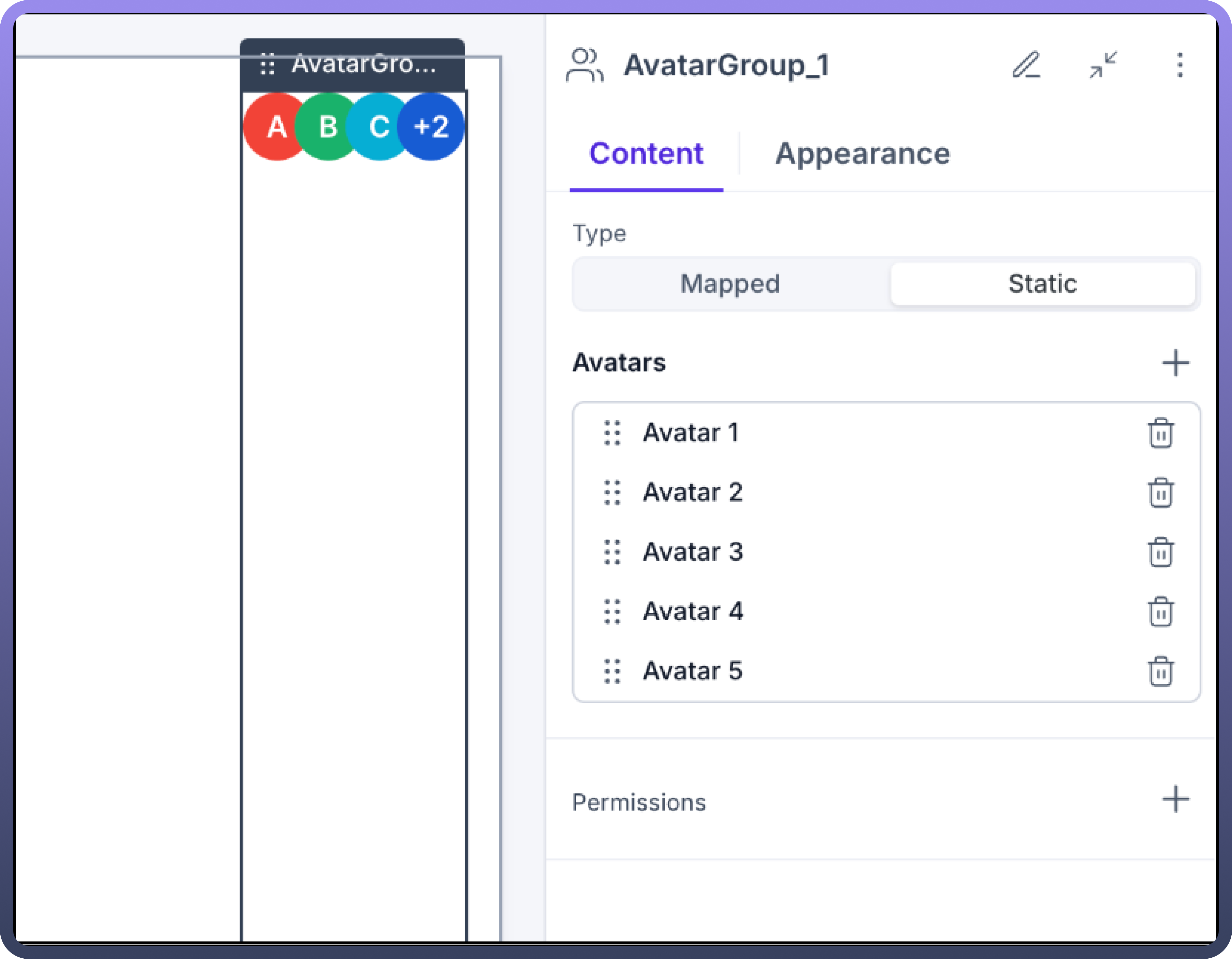
Creating a Static Avatar Group:
Add the Avatar Group component to your page from the component library
Select "
Static" as the Type optionUse the Avatars section to add individual avatars:
Click the "
+" button to add a new avatarConfigure each avatar's properties (Avatar 1, Avatar 2, etc.)
Use the trash icon to remove unwanted avatars
Creating a Mapped Avatar Group:
Add the Avatar Group component to your page from the component library
Select "
Mapped" as the Type optionConfigure the Mapped Avatars section:
Select your data source
Map the Avatar ID field to your data
Choose between Icon or Image representation
Set fallback text options
Setting Avatar Appearance:
Navigate to the Appearance tab
Select the appropriate size for your avatars
Set the maximum number of visible avatars
Configure layout settings including spacing and alignment
Customize background and border styling as needed
Use Cases
Team Member Display
Use Avatar Groups to represent team members working on a project or assigned to a task. Configure the component to display user profile images with appropriate fallback text for accessibility.
Collaborative Workspaces
Implement Avatar Groups to show active participants in collaborative documents or workspaces. Connect to live data sources to dynamically update as users join or leave the space.
Activity Indicators
Pair Avatar Groups with interaction components to create interactive user listings that display activity status, online presence, or participation levels.
User Selection Interfaces
Use Avatar Groups in user selection interfaces, allowing users to quickly identify and select colleagues for sharing, permissions, or collaboration.
Best Practices
Optimal Visual Presentation
Size Consistency: Maintain consistent avatar sizes throughout your application
Limited Visibility: Set appropriate "
Max Visible Avatars" to prevent overcrowdingAdequate Spacing: Ensure enough spacing between avatars for clear visual separation
Performance Considerations
For large datasets, implement pagination or filtering when displaying Mapped Avatar Groups
Use appropriate image optimization for avatar images to ensure fast loading times
Accessibility
Always provide meaningful fallback text for each avatar
Ensure sufficient color contrast between avatars and background
Interactive Capabilities
Avatar Groups can be enhanced with interactive features:
Click Actions: Configure what happens when users click on an avatar
Hover States: Define visual feedback when users hover over avatars
Selection States: Implement visual indicators for selected avatars
Permissions
Control who can see or interact with Avatar Groups by setting visibility permissions based on user roles or other contextual factors. This ensures that only authorized users can view or interact with specific Avatar Groups.