
Overview
Components serve as the building blocks of your application, enabling you to display data, capture user input, and perform various actions.
In this article, you will learn about the types of components and how to add them to your interface.
.png&w=1080&q=75)
.png)
Layout Components
These are used to structure and organize other components within the interface.
| Component | Description |
Container | Container provides structure to the application interface and is used to divide it into a defined rigid layout. A container can hold a fixed number of components within it. |
Stack | Stack is a flexible UI component that groups and organizes components vertically or horizontally. Stacks automatically manage spacing and alignment between child elements and allow an indefinite number of components within them. |

Tip
Avoid overusing layout components. Add components directly to the root section for top-level placement. Use containers or stacks to organize components within sections for better design control.
Basic Components
They are essential UI elements like buttons, dividers, icons, and text for building the core functionality of your application.
| Component | Description |
Button | Adds a clickable button to perform actions. |
Divider | Adds a horizontal or vertical divider to separate content. |
IconButton | Adds a button with an icon to perform actions. |
Link | Adds a hyperlink to navigate to different external URLs. |
Loader | Displays a loading indicator. |
Progress Bar | Shows progress in a visual bar format. |
Text | Displays text static or dynamic. |
Icon | Adds an icon to the application for visual emphasis. |
Image | Displays an image. |
Tag | Adds a tag or label for categorization or emphasis. |
Filters | Adds filtering options for data displayed in other components. |
Rich Components
Rich Components are ready-to-use UI components that pack multiple features into single, easy-to-implement packages.
These components offer sophisticated functionality like interactive tables, customizable charts, and advanced form inputs - all pre-built and easily configurable.
| Component | Description |
Alert | Displays important messages to users in a visually distinct way. |
Card | A modular content container featuring customizable header, body, and footer sections. |
Chart | Visualizes data in various chart formats such as bar, line, pie charts etc. |
Key Value | Used for displaying paired data, presenting a key alongside its corresponding value in a clear, structured format |
Tabs | Organizes content into multiple tabs for better navigation and structure. |
Modal | Modal box is a popup dialog that overlays the main application and is used to capture user input, display important information, or prompt user actions without navigating away from the current page. |
Stat Card | Displays statistical information with visual emphasis. |
Multi Stats Card | Shows multiple statistical metrics in a single card. |
Data Table | Presents data in a tabular format with various customization options. |
Drawer | Creates a slide-in drawer for additional content or options. |
Form | Collects user input through various form fields. |
CodeEditor | Allows users to write and edit code within the application. |
Timeline | Displays a timeline of events or activities. |
Repeatable Components
These elements are designed for repeating patterns, such as lists or grids, enabling dynamic data display.
| Component | Description |
Repeatable | Allows repeating a set of components for multiple items. |
Repeatable List | Displays a list of repeatable items. |
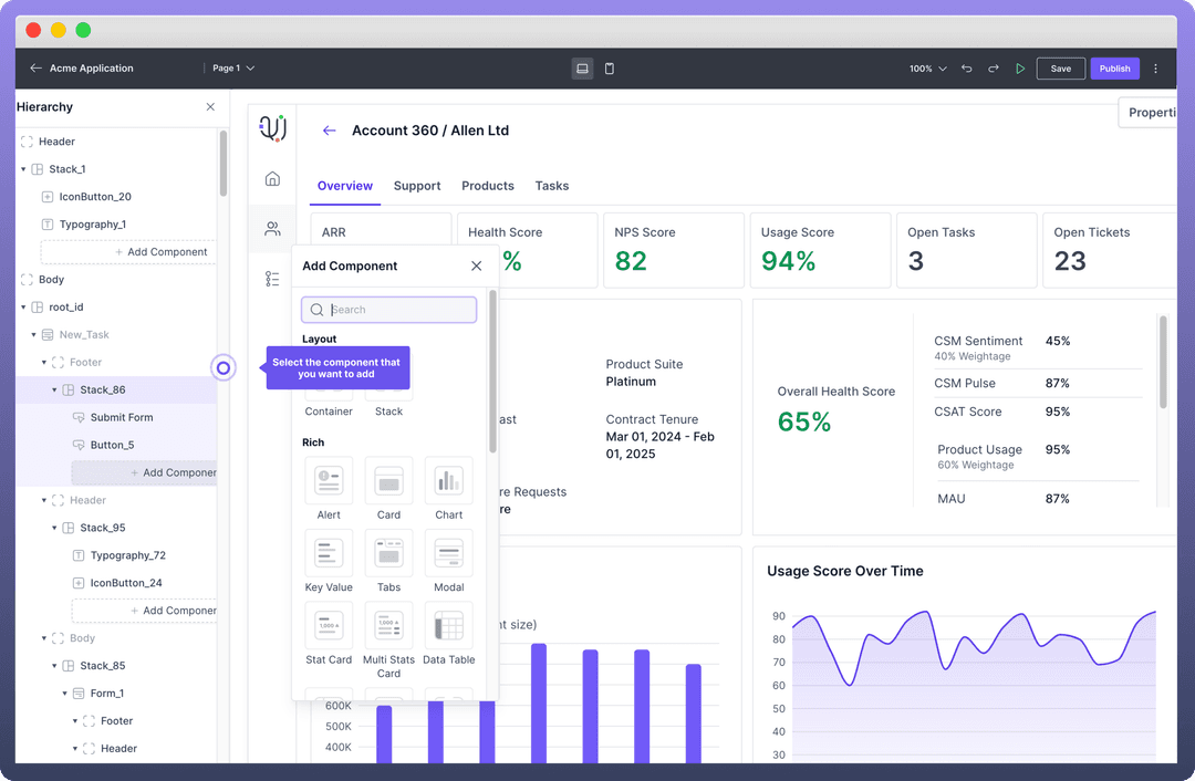
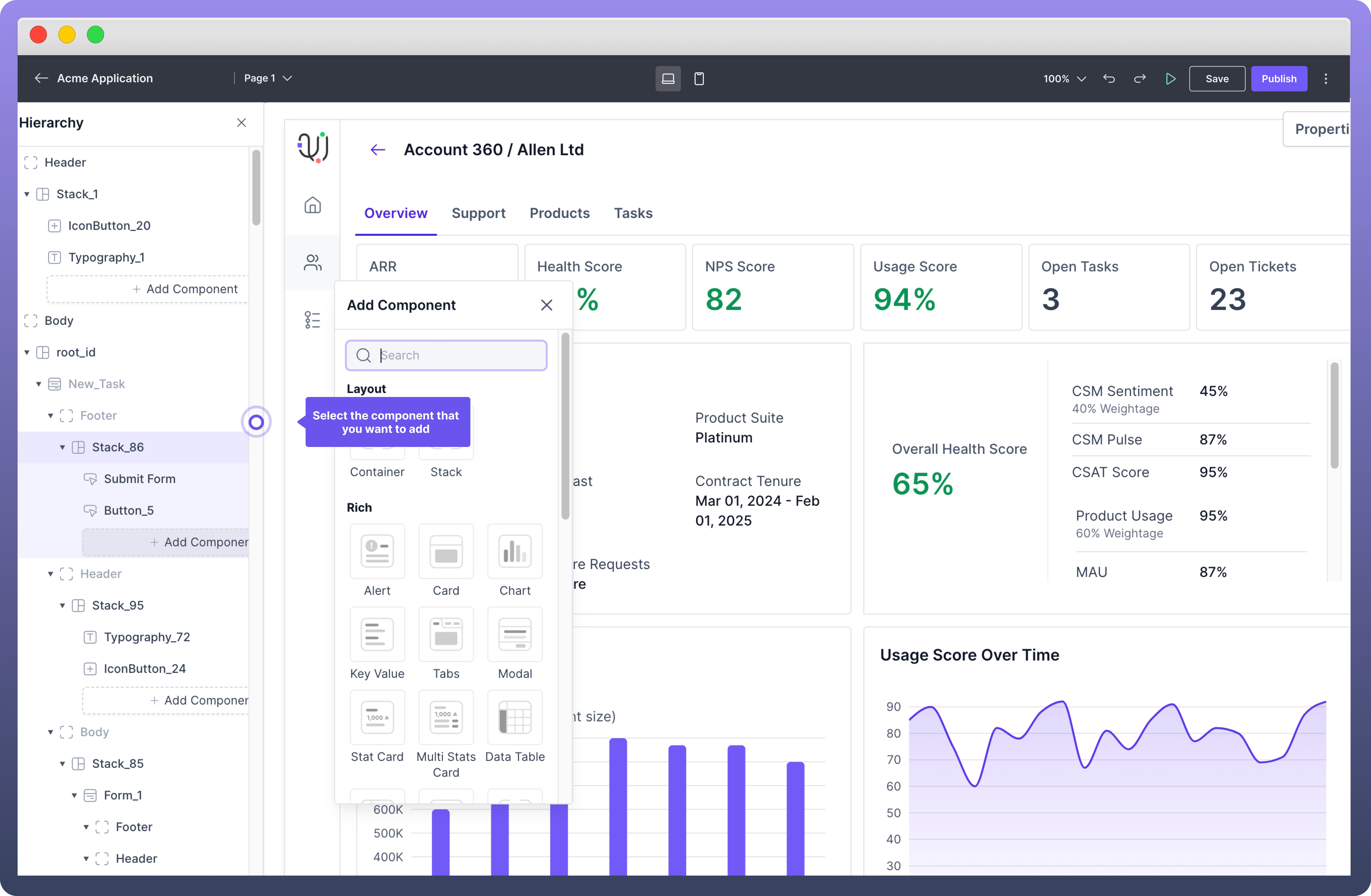
Add Components into Interface
Access the Component Library Navigate to the left sidebar to explore various categories of components such as Layout, Rich, Repeatables, and Basic. Browse through the available components and select the ones that best fit your application’s needs.
Tip
It’s always recommended to rename the component. Click the component in the hierarchy panel, select "Rename" from the three-dot menu, type the new name, and the name of your component will be changed.
Configure Component Properties Click on the component to open its properties panel on the right side, where you can modify settings like data bindings, appearance, and interactions, permissions & much more. You can read more about properties of each component in their specific articles.
Tip
Before you start adding components, create a rough sketch of your application layout. This will help you visualize the structure and placement of various elements.
Best Practices
Use Layout Components Wisely: Use containers, stacks, and other layout components to logically organize your application. However, avoid overusing these components when they are unnecessary.
Use Meaningful Names for your components: Name your components descriptively to reflect their purpose. This makes it easier for others to understand and maintain your application.
Break Down Complex UI: Divide complex user interfaces into smaller, manageable components. This modular approach makes it easier to debug, test, and maintain your application