
Overview
The Column Chart component is a powerful data visualization tool designed to display quantitative information through vertical bars or columns. This chart type excels at comparing values across different categories or showing trends over time periods, making it ideal for business metrics, performance tracking, and analytical reporting. Column charts are particularly effective for visualizing ticket volumes, trend analysis, and performance metrics where clear visual comparison between different time periods or categories is essential.
When to Use a Column Chart?
Column charts are particularly valuable when you need to
Monthly Performance Tracking: Display ticket volumes, sales figures, or user activity across different months to identify seasonal patterns and growth trends. Track performance changes over time periods effectively.
Team Comparison Analysis: Compare performance metrics across different teams, departments, or regions to identify top performers and areas needing improvement. Visualize which teams exceed expectations and need support.
Priority-Based Reporting: Show distribution of tickets, tasks, or issues across different priority levels (Critical, High, Medium, Low) to help managers understand workload distribution and resource allocation needs. Assess workload balance and resource allocation across priority levels.
Category Performance Visualization: Display performance across different service categories, product lines, or customer segments to understand which areas generate the most activity or revenue. Identify highest performing categories and revenue generating segments.
Threshold and Goal Tracking: Compare actual performance against targets or thresholds across different time periods or categories. Show progress toward goals with clear visual indicators. Compare actual results against established targets and thresholds.
How to configure a Column chart?
Below are the details mentioned which describe each configuration option for Column charts in Unify’s Application builder:
Basic Configuration
Chart Type
Column: Defines the visualization type as a vertical bar/column chart
This determines how your data will be displayed (columns rising vertically from the X-axis)
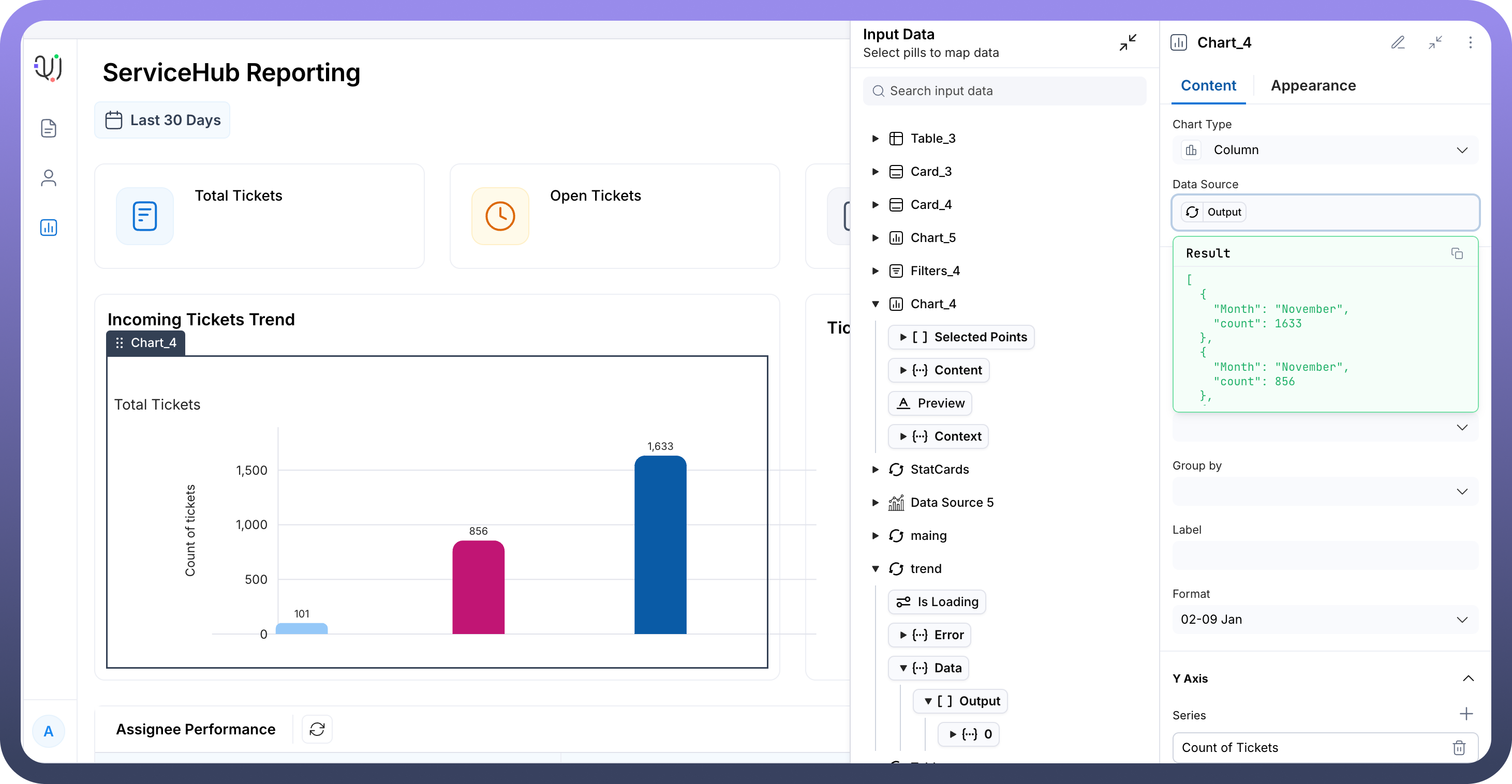
Data Source
This is where the input values for the chart can be mapped
For e.g in the screenshot below, we have mapped a data source “
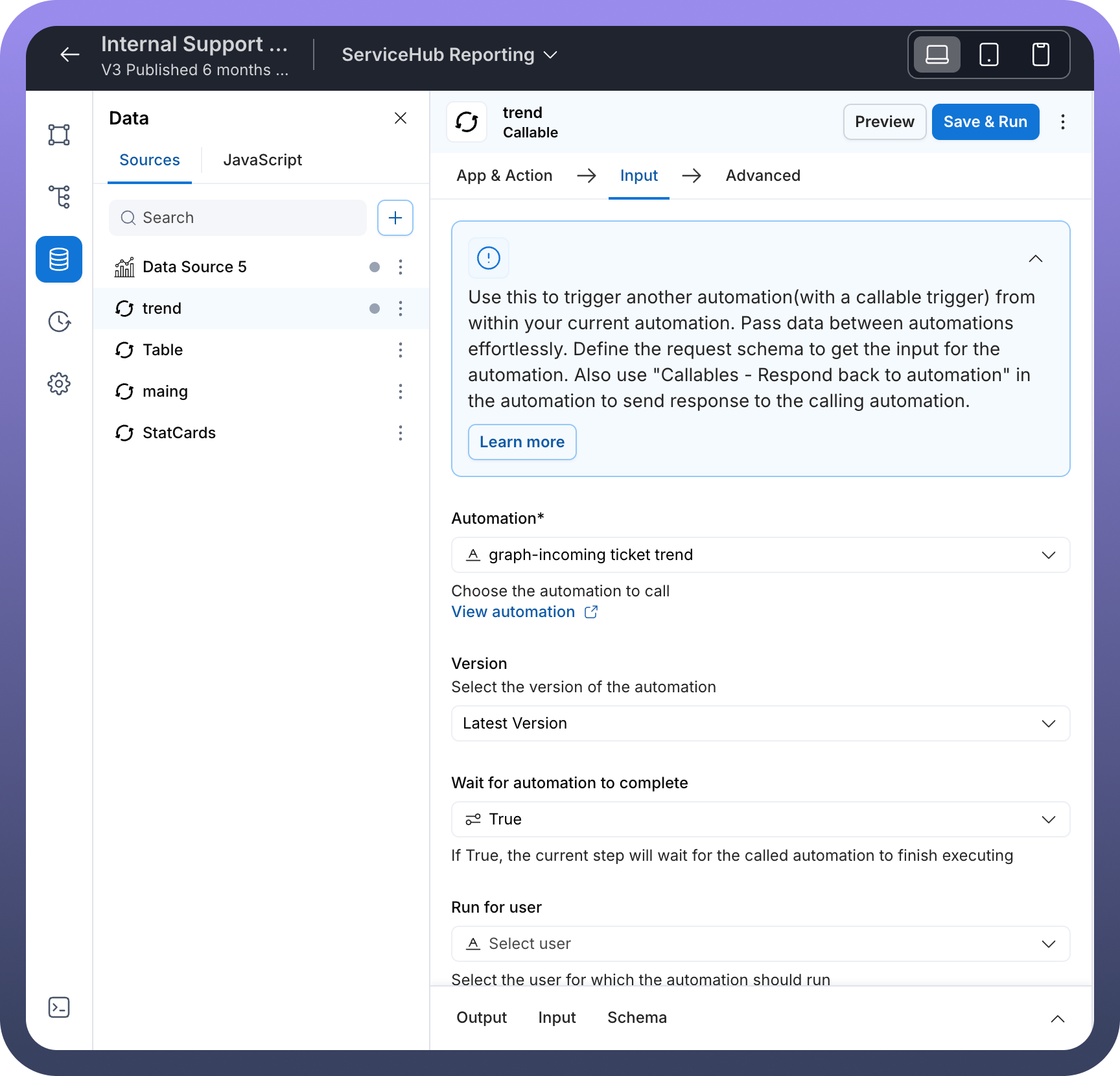
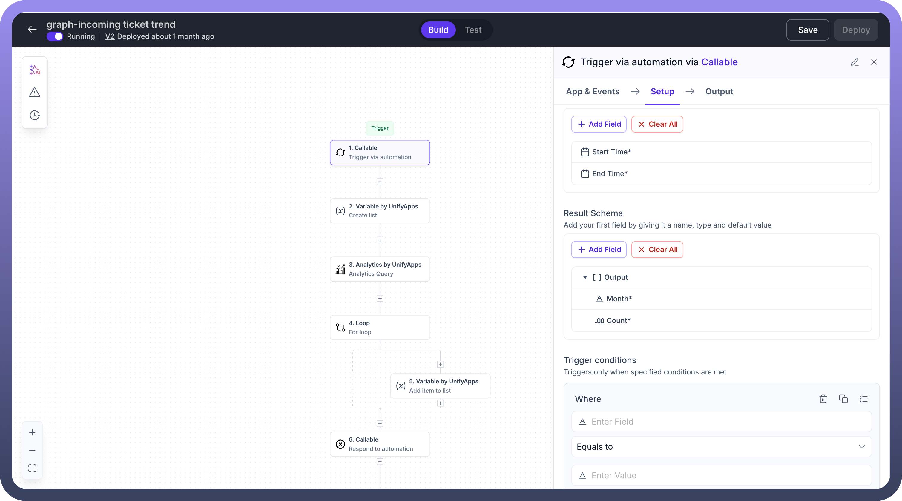
trend -> Output”, to display the valuesIn turn the datasource “
trend” fetches values for the chart via an automation “graph-incoming ticket trend” as mentioned in the screenshotThis automation is used to fetch all the values for the chart


X Axis Configuration
Plot Periodic Values
Toggle switch that enables/disables periodic plotting on the X-axis
When enabled, allows for time-based or sequential data representation
Value
Defines what data field is used for the X-axis values
In this case, it's set to display “
Count” as the horizontal axis categories
Group by
Allows you to group data points by specific categories or dimensions
Helps organize data into meaningful segments for comparison
Y Axis Configuration
Series
Defines what metric is being measured and displayed as column heights
This is the primary data being visualized (the vertical values)
Label
Text label that identifies what the Y-axis represents
Provides context for users about what the numbers mean
Type
Here the output type can be defined in which form the numbers on the chart ned to be display
Different options are available like :
Number,Currency,Percentage,Durationetc.
Advanced X Axis Settings (When Plot Periodic Values is enabled)
Start value
Month: Defines the beginning point of your time seriesSets which month the chart should start displaying from
End value
Defines the ending point of your time series
Sets the range limit for your periodic data
Format
02-09 Jan: Specifies how date/time values are displayedControls the visual format of X-axis labels
Appearance Tab Parameters
Chart Colors
Colour by
Determines how colors are applied to the chart elements
3 options are available:
Series : Applies same color to all chart and elements
X axis value: Each bar on the x-axis can have different colors
Conditions: Set conditional colors for each data element

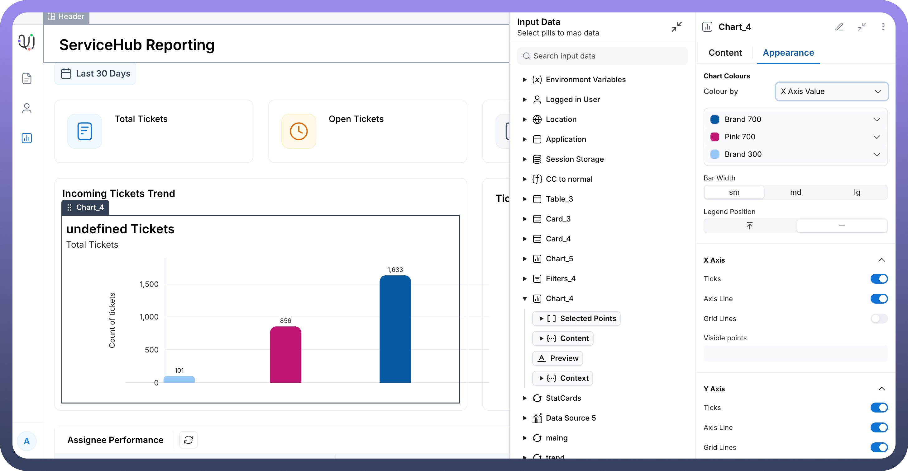
Bar Styling
Bar Width
Options: sm, md, lg
Controls the thickness of the columns
Affects visual density and readability
Legend Position
Controls where the chart legend appears
Options typically include top, bottom, left, right, or hidden
X Axis Appearance
Ticks
Toggle to show/hide tick marks on the X-axis
Helps users identify specific values along the horizontal axis
Axis Line
Toggle to show/hide the main X-axis line
Provides visual structure to the chart
Grid Lines
Toggle to show/hide vertical grid lines
Helps users read values more accurately across the chart
Y Axis Appearance
Ticks
Toggle to show/hide tick marks on the Y-axis
Provides reference points for reading values
Axis Line
Toggle to show/hide the main Y-axis line
Gives structure to the vertical axis
Grid Lines
Toggle to show/hide horizontal grid lines
Makes it easier to read exact values across different columns
Key Configuration Tips
Data Source Connection: Ensure your Output data source provides the correct data structure with the fields you're referencing in Value and Series settings.
Periodic Values: When plotting time-based data (like months), enable "
Plot Periodic Values" and configure Start/End values appropriately.Visual Clarity: Use appropriate Bar Width and enable Grid Lines for better readability, especially with multiple data points.
Color Consistency: Choose colors that align with your application's branding and provide good contrast.
Responsive Design: Consider how the chart will appear on different screen sizes when setting dimensions and text sizes.