Introduction
Container is a layout component that groups and organizes UI components into a rigid layout. A container can hold a fixed number of components within it.
This article will guide you through configuring Containers.
Primary Use Cases
Grouping Related Components: Containers can be used for grouping form
fields,buttons, andlabelswithin a single container to create a unified form section.Crafting Flexible Web Layouts Using Containers : Containers can be used with adaptable column layouts to vary the number of displayed items according to screen size (e.g., changing from a
4-columnlayout to a2-columnlayout)Applying Consistent Styling : It can be used for applying a specific
paddingormarginto all components within a container for a uniform look and feel.
Configure a Container
Choosing the Layout options
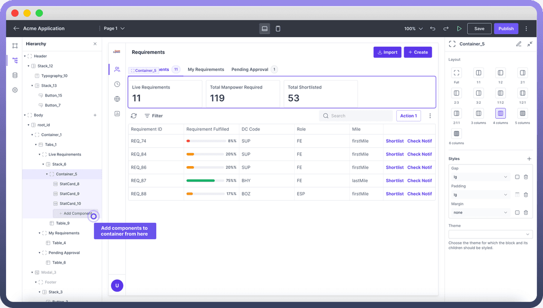
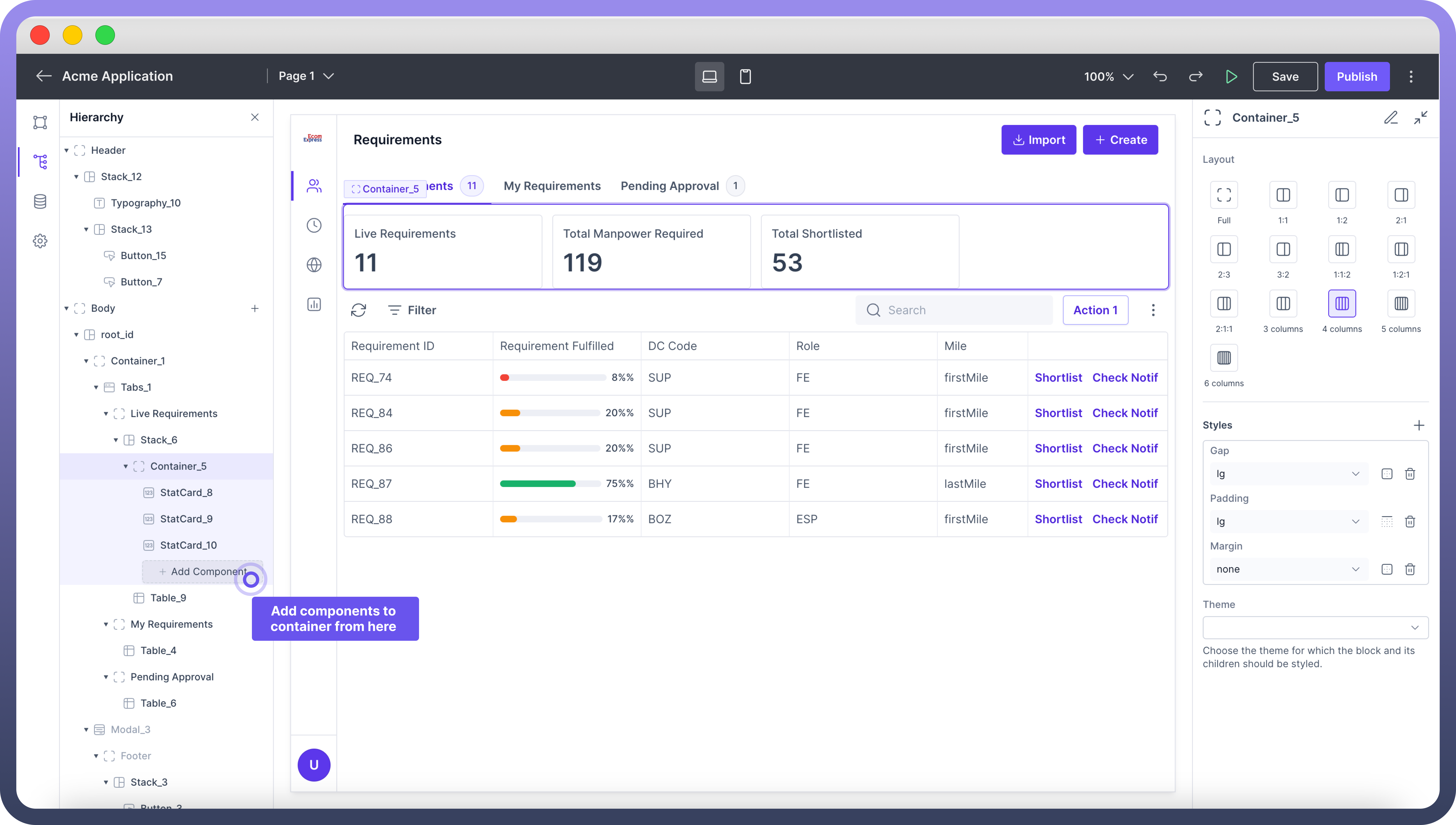
Users can select from various column layouts (e.g. - full , 1:1 , 1:2 , 2:1) to control the distribution of content.
Users can also select from various options ranging from single to multiple columns (up to 6), enabling defined breakdown of containers into columns.
.png&w=1080&q=75)
.png)
Adding components in your Container
Once the layout of the container has been selected you would find it in hierarchy with segregations as defined in the previous step.
Select and add the desired components (e.g.,
text,images,charts) to the container as per your design.

Tip
You can also have a container, or a stack inside a container allowing you to control the layout in all possible ways.
Style your Container
You can adjust the gap, padding, and margins to arrange and style the child components in the container.
"Also, by clicking the ‘+’ button inside appearance you get access to more styling options like adjusting the container height, width etc. "
You can also choose the theme for the container and its children from the theme dropdown.
Details about the styling can be found in the table below:
| Attributes | Properties |
Padding | Add space inside an element's border to create separation between the content and the border. |
Height | Set the height of an element to control its vertical size. |
Min-Height | Define the minimum height an element can be, ensuring it doesn't shrink below this value. |
Max-Height | Specify the maximum height an element can reach, preventing it from growing too tall. |
Gap | Set the space between rows and columns in a grid or flex container to create consistent spacing. |
Margin | Set the outer space around an element to create distance between it and surrounding elements. |

Refer
For more detailed information on styling a component, refer to the Appearance article.
