
Overview
Carousel by UnifyApps delivers a dynamic, interactive slideshow component that enables you to showcase multiple pieces of content in an engaging, space-efficient format. This versatile component allows you to create compelling visual presentations, image galleries, product showcases, and content rotations that capture user attention while maintaining a clean interface design.
Use Cases
Product Showcases and E-commerce: Display multiple product images, features, or variations in a single container, allowing customers to browse through different views seamlessly while maximizing screen real estate.
Content Highlights and Featured Items: Rotate through featured articles, testimonials, announcements, or promotional content to keep your interface fresh and draw attention to important information.
Media Galleries and Portfolios: Create stunning visual presentations for photography, artwork, case studies, or project portfolios that allow users to explore content at their own pace.
Dashboard Widgets and Data Visualization: Present multiple charts, metrics, or data views in a rotating format, perfect for executive dashboards or monitoring interfaces where space is premium.
Component Configuration
Carousel Structure
The Carousel component organizes multiple slides into a navigable sequence with smooth transitions and intuitive controls for optimal user experience.
Key Elements:
Slide Container: Houses individual slides with content or media
Navigation Controls: Arrow buttons for manual slide navigation
Indicator Dots: Visual markers showing current position and total slides
Auto-rotation: Optional automatic slide progression with configurable timing
Content Configuration
Configure the slides and media that will be displayed within your Carousel component.
Content Settings:
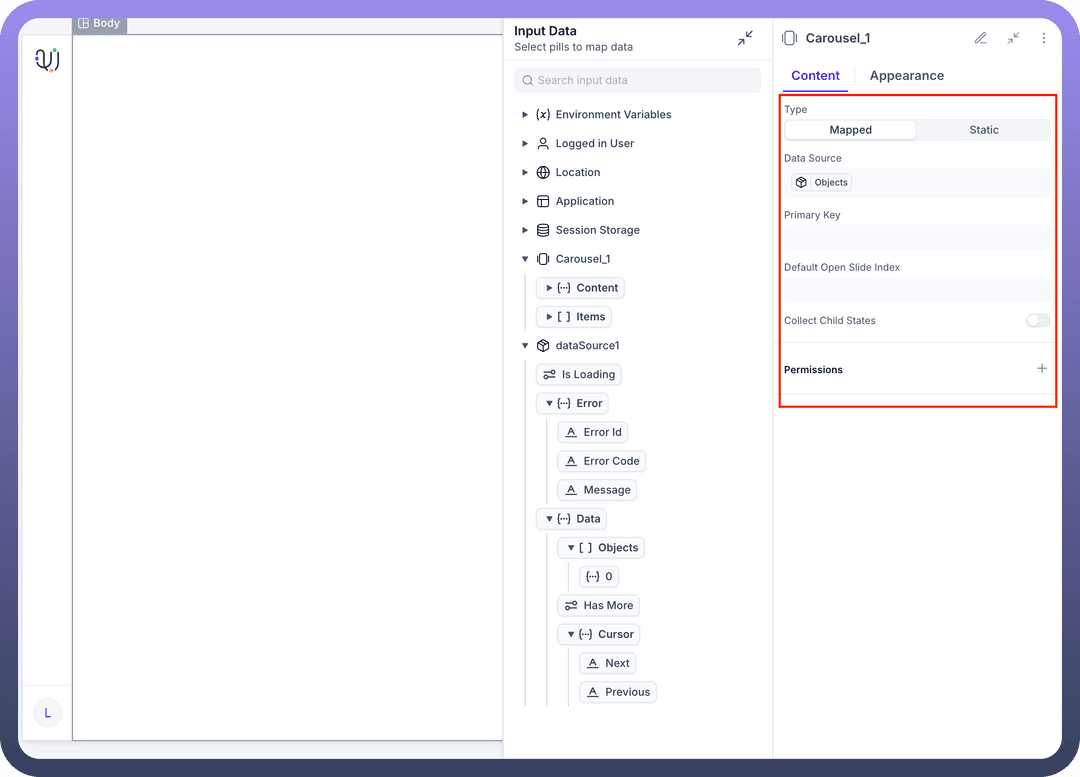
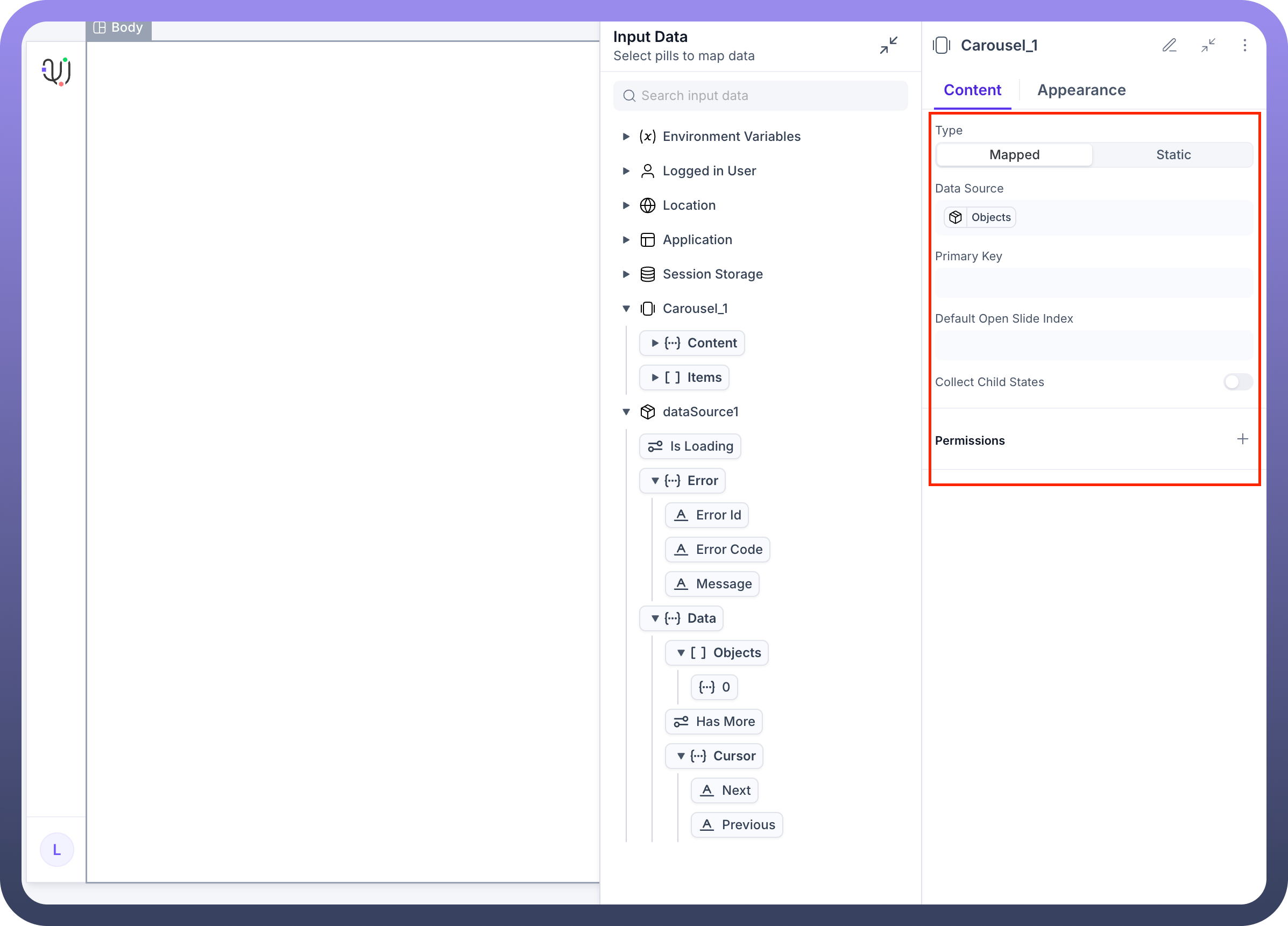
Type: Choose between Mapped (dynamic data-driven) or Static slide configurationSlides: Add, remove, and organize the sequence of carousel slidesSlide 1
Slide 2
Slide 3
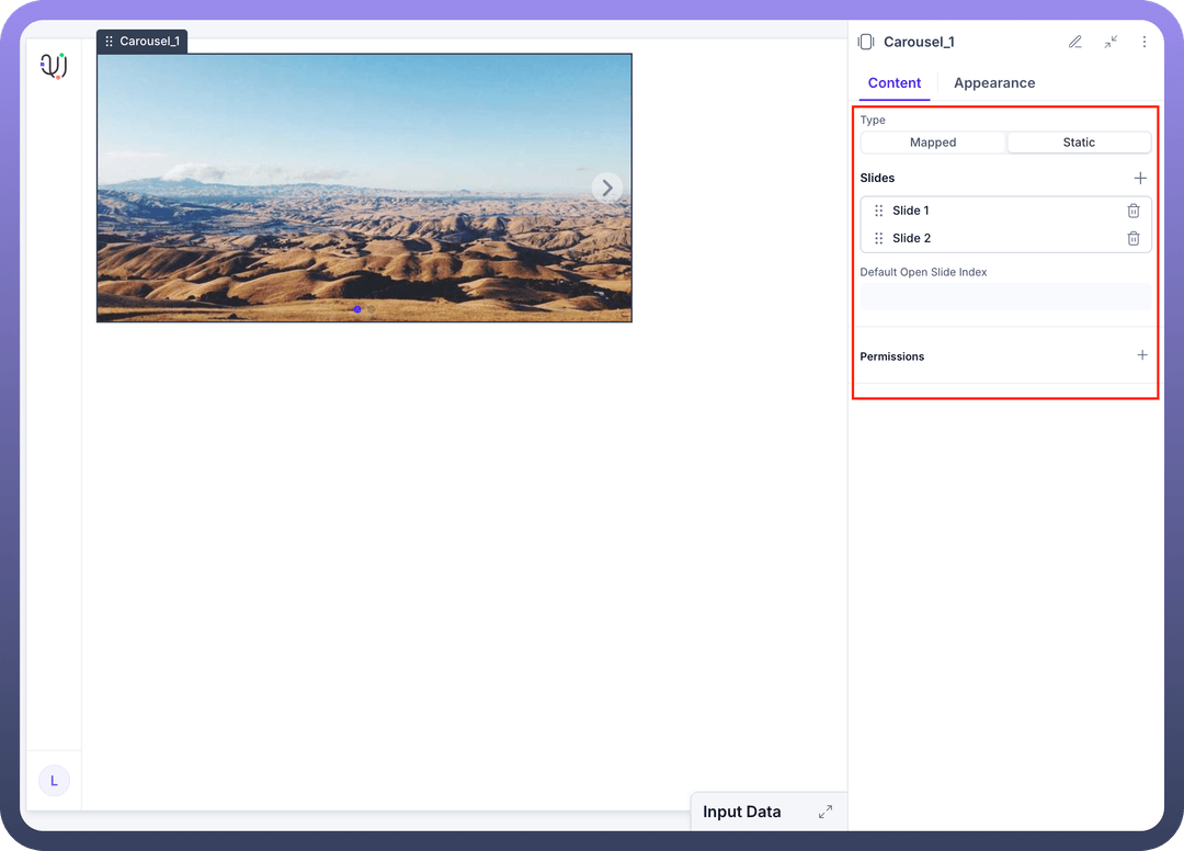
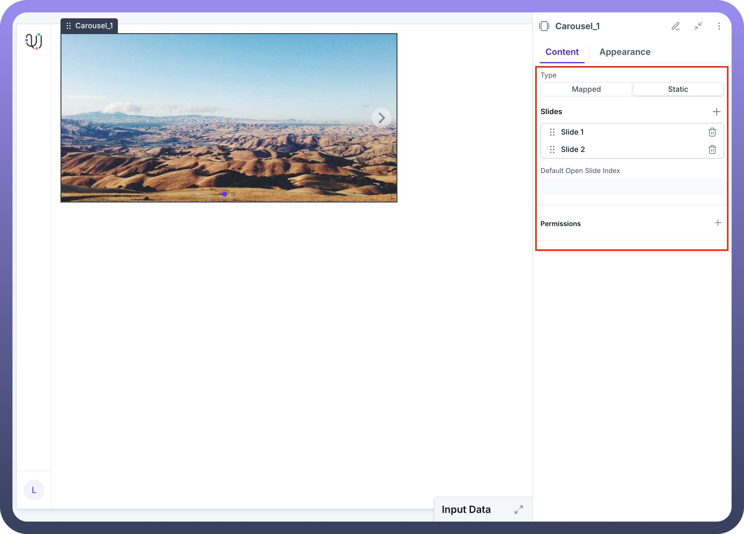
Data Source: Connect to external data for dynamic content populationPrimary Key: Define unique identifiers for mapped contentDefault Slide: Set which slide should be displayed initiallyCollect Child States: Gather interaction data from slide components
Adding Carousel to Your Application
The Carousel component integrates seamlessly into your application interface and can be configured within any container element.
Implementation Steps:
Navigate to your application builder interface
Select the parent container where you want to add the carousel (e.g., Stack, Body, Section)
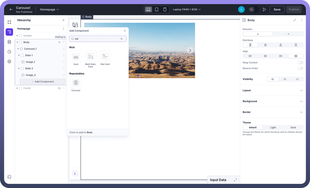
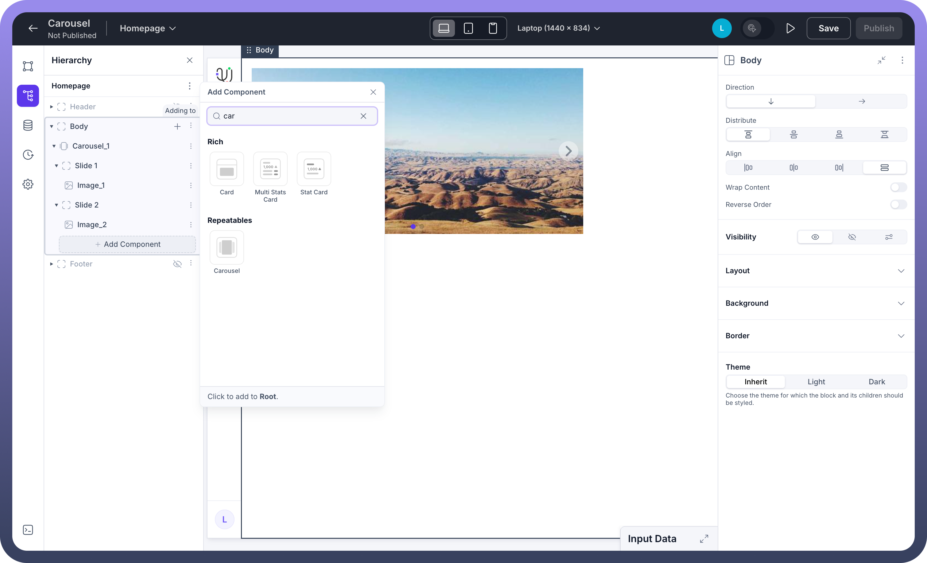
Click "
Add Component" and search for "carousel"Select the Carousel component from the Repeatables section
Configure your carousel content and slides
Customize appearance and behavior settings
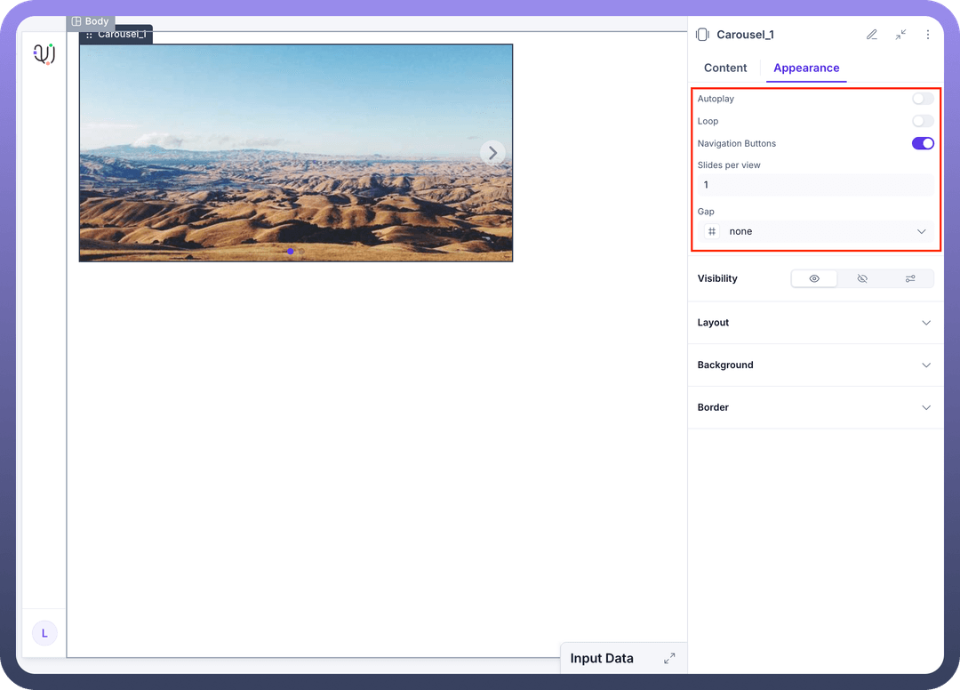
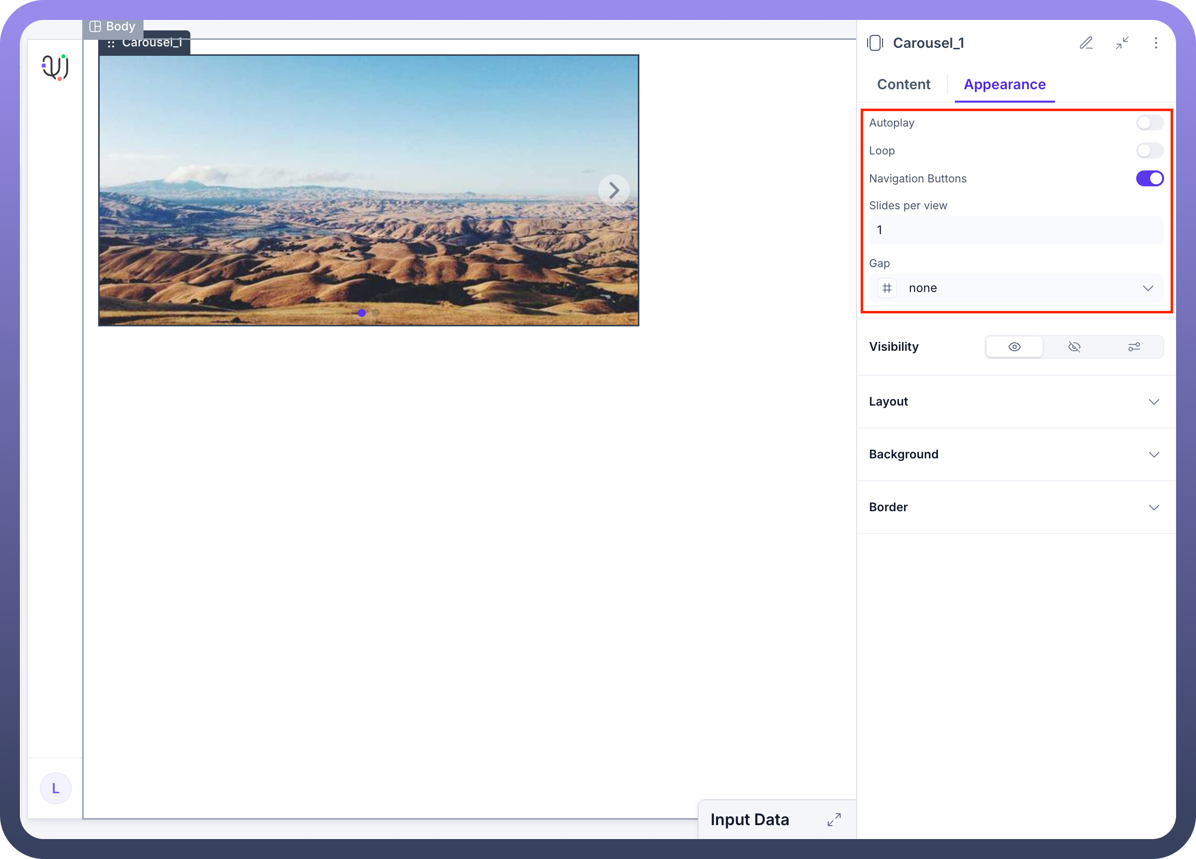
Appearance Configuration
Tailor the visual presentation of the Carousel component to align with your application's design language and enhance user engagement.
Appearance Settings:
Autoplay: Enable automatic slide progression with customizable intervalsLoop: Allow continuous cycling through slides (seamless transition from last to first)Navigation Buttons: Toggle visibility of previous/next arrow controlsSlides per View: Configure how many slides are visible simultaneouslyGap: Adjust spacing between slides for optimal visual separationVisibility: Control when and how the carousel appears to usersLayout: Configure positioning, dimensions, and responsive behaviorBackground: Customize backdrop styling and visual treatmentBorder: Define edge styling and visual boundaries
Typical Content Types:
High-resolution images and graphics
Product photography and variations
Video content and multimedia
Text-based slides with rich formatting
Mixed media presentations
Interactive components and widgets
Implementation Steps
Plan Your Content:
Identify the type of content to be displayed
Determine optimal slide count and sequence
Consider user interaction patterns and navigation preferences
Plan responsive behavior across different screen sizes
Add the Carousel Component:
Navigate to your application builder
Select the appropriate parent container
Add the Carousel component from the Repeatables section
Configure Content:
Add each required slide with appropriate content
Set up data binding for dynamic content if needed
Configure slide transitions and timing
Define navigation and interaction behaviors
Set Up Navigation:
Enable/disable automatic progression
Configure manual navigation controls
Set up indicator dots and position markers
Define loop behavior and slide boundaries
Customize Appearance:
Set slide dimensions and aspect ratios
Adjust spacing and gap configurations
Customize navigation button styling
Configure responsive behavior for different devices
Data Handling
Mapped vs. Static Configuration
Mapped Configuration:
Dynamically generate slides based on external data sources
Perfect for product catalogs, news feeds, or user-generated content
Automatically updates when source data changes
Supports conditional slide creation and customization
Static Configuration:
Pre-defined slides with fixed content structure
Ideal for marketing carousels, feature highlights, or curated showcases
Simpler to configure for consistent, branded presentations
Full control over individual slide content and styling
Slide Interactions
Configure user interactions and system responses for enhanced carousel functionality:
Common Interactions:
On Slide Change: Trigger analytics tracking or content loading
Data Binding: Connect slide content to dynamic data sources
Conditional Display: Show/hide slides based on user preferences or data
Event Triggering: Initiate actions when users interact with specific slides