


The Flow Builder is the visual canvas where you assemble, configure, and test an automation — adding steps from the connected app catalog, wiring data between them with pills, and managing the full build lifecycle from trigger to deployment.
Overview
The Flow Builder is the canvas where you assemble an automation visually. The trigger sits at the top and steps flow downward along their connections. You add steps, connect them, configure each one in the side properties panel, and test as you go.
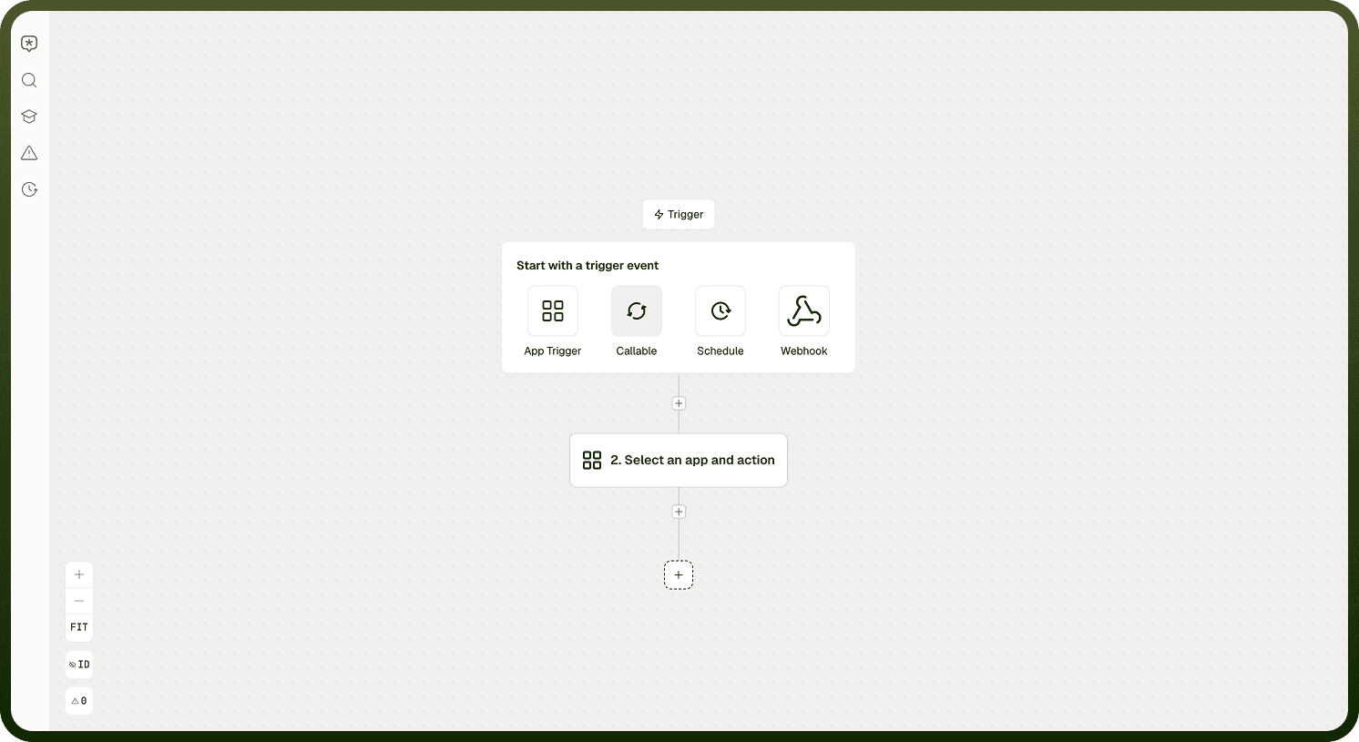
The canvas is surrounded by several UI regions:
Left rail — icon strip with Copilot, Search, Documentation, Errors, and Versions panels.
Build header (top) — Build/Test toggle, Save, Deploy, workflow score badge, and error count.
Canvas zoom toolbar — zoom in, zoom out, fit-to-view, and the step ID toggle.
Canvas Navigation
The zoom toolbar on the canvas provides three controls: zoom in, zoom out, and fit-to-view, which frames the entire automation so every step is visible. An ID toggle alongside the toolbar switches between View step IDs and Hide step IDs. Enable it when you need to see each step's internal identifier for debugging or support, and disable it for a cleaner view.
The Properties Panel
When you select a step on the canvas, its settings open in the side properties panel. The panel header displays the step's app icon and an editable name. Settings are organized into tabs that you move through left to right.
Step Type | Tabs Available |
|---|---|
App step | App & action, Connection, Input, Output |
Trigger | App & event, Setup |
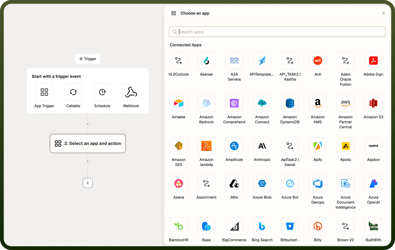
Selecting a different step on the canvas swaps the panel to that step's settings. The X button closes the panel.
App & Action Tab
The first tab lets you search the catalog of available apps and actions and pick one. The panel labels your current selection as the selected action (or selected trigger for the trigger step). Some steps also let you create a custom action. Once an action is chosen, the Connection, Input, and Output tabs unlock.
Connection Tab
For steps that communicate with an external app, the Connection tab lists the connections available for that app. It splits available connections into your currently selected connection and other active connections, with a search box to filter them. If the connection you need is not listed, Add new connection opens the connection setup flow without leaving the step.
Note: A step will not run until it has a valid connection selected.
Input Tab
The Input tab is where you supply the data a step needs to run. Fields are generated from the action you picked — different actions show different fields, and some fields are dynamic: they appear or change their options after you fill an earlier field. Required fields are marked, and most fields show inline help text.
At the bottom of the Input tab is an advanced settings strip with three per-step options:
Setting | Description |
|---|---|
Caching | Reuse a previous result instead of re-running the step. |
Retry | Automatically retry the step on failure. |
Error handling | Control what happens when the step errors: Stop automation, Follow error path, or Continue automation. |
Flow Builder additional configuration
Note: These options apply to the individual step only, separate from automation-wide settings configured in the automation settings screen.
Output Tab
The Output tab shows the result of the step as a searchable tree. You copy fields from this tree to build data pills that can be mapped into the inputs of later steps.
Trigger Configuration
Select the trigger at the top of the canvas to configure how the automation starts. Its App & event tab lets you choose the app and the event that starts the flow — a schedule, an app event, a webhook, or callable inputs. The Setup tab holds the trigger's own configuration fields. The trigger also defines the starting data that the rest of the flow can map from.
Editing Steps
Adding a Step
Click the dashed + button below the last step, or use the add affordance between two existing steps. A picker opens where you choose:
An app and action from the connected app catalog.
A control-flow step — condition, branch, loop, or scope.
A built-in utility step.
The new step connects to the one above it. Open it to choose its connection and fill its inputs.
Note: The add button only appears when you have edit access. A read-only automation shows the flow but no add control.
Right-Click Actions
Right-click any step on the canvas to open a quick-action menu. The options shown depend on the step type — the trigger cannot be skipped or removed, and paste only appears when you have something on the clipboard.
Action | Description |
|---|---|
Cut | Remove the step and place it on the clipboard. An Undo option appears immediately after. |
Copy | Copy the step to the clipboard without removing it. |
Paste above | Insert the clipboard step above the right-clicked step. |
Paste below | Insert the clipboard step below the right-clicked step. |
Skip / Unskip | Bypass the step during runs without deleting it, or restore it. |
Rename step | Edit the step's display name inline. |
Delete step | Permanently remove the step. An Undo option appears immediately after. |
Copy, Cut, and Paste
Select one or more steps and use Copy or Cut from the right-click menu, the multi-select bar, or the standard keyboard shortcuts on the canvas. Then use Paste to drop them back — including into a different automation, since steps are copied as portable data. Connections between copied steps are preserved. The trigger and end markers are never copied.
Working with Multiple Steps
Select multiple steps to reveal the bulk actions bar, which shows how many steps are selected and offers the following actions:
Bulk Action | Description |
|---|---|
Cut | Remove all selected steps and place them on the clipboard. |
Copy | Copy all selected steps to the clipboard. |
Skip | Bypass all selected steps during runs without deleting them. |
Unskip | Restore all previously skipped steps. |
Group into sub-automation | Collapse the selection into a reusable child automation. |
Delete | Remove all selected steps together. |
Skipping a Step
Skip marks a step so it is bypassed when the automation runs — the flow continues as if that step were not there, without deleting it. Use Skip to temporarily disable part of a flow while testing or debugging, then Unskip to restore it. The trigger cannot be skipped.
Control-Flow Steps
Beyond app actions, you can add steps that control how the flow executes. You add control-flow steps from the same picker as app actions.
Step Type | Description |
|---|---|
Condition | Splits the flow into a yes path and a no path based on a filter you define. The filter reads back in plain language (e.g., status = active AND amount > 100). |
Branch | Routes the flow to one of several paths based on defined criteria. |
Loop | Repeats its inner steps once per item in a list. During a run, the current iteration count is visible on the step. |
Scope | Groups steps together so they share error handling and can be managed as a block. |
Mapping Data Between Steps
You connect data between steps using data pills — references to an earlier step's output (or the trigger's data) that resolve to a live value at run time. Instead of typing a fixed value into a field, you insert a pill, and the field takes that step's output when the automation runs. Most input fields accept data pills; a small number of fixed-value-only fields are noted in their inline help text.
Finding Output Values to Map
The Output tab of each step shows its result as a searchable tree. Browse or search the tree to locate the field you want to reference, then copy it as a data pill to paste into a downstream step's Input tab. This carries data through the flow: for example, a trigger record into a fetch step, and that record's field into a message body.
Autofill
Autofill auto-maps a step's input fields from an earlier step's output so you do not have to wire every field by hand. Open it from the Input tab, pick the step whose output you want to map from, and it fills the matching fields with data pills for you. You can then adjust any field that did not map the way you intended.
Managing Optional Fields
The Input tab shows required and commonly used fields by default. Use Manage optional fields to open a searchable list of the action's remaining optional fields and select the ones you want visible on the form. This keeps the input form concise while still letting you reach any advanced field when you need it.
Input Field Types
The Input tab renders different field controls depending on the action and the type of data expected. The table below describes the field types you will encounter.
Field Type | Description |
|---|---|
Text / text area | Single-line text box for short values; multi-line text area for messages, bodies, or descriptions. Both accept data pills and expressions. Plain-text-only fields are noted in their help text. |
Lookup (dropdown) | A searchable dropdown whose options are fetched live from the connected app — for example, a base, table, channel, or folder. Requires the connection (and sometimes an earlier selection) to load. Most lookups let you enter a custom value such as an ID when your target is not listed. Use the refresh control if the list looks stale after changing a dependency. |
Single-select / multi-select | A dropdown for choosing exactly one option (single-select) or several options displayed as chips or tags (multi-select). Some single-select fields appear as radio buttons; some multi-select fields appear as checkboxes. |
Toggle | A simple on/off switch for yes/no settings. |
Expression / code editor | A larger editor for writing an expression, JSON, or a script, with data-pill insertion. Use when a plain value is insufficient — for example, to combine fields, compute a value, format a number or date, or build a JSON payload. |
Secret / password | A masked input box for tokens, keys, and passwords. Prefer storing secrets in a connection where possible so they are reused securely rather than typed into individual steps. |
Date / date-time | A date picker, optionally with time. You can also map a pill that supplies a date value, or compute one with an expression. Format the value in an expression before mapping it when a downstream system expects a specific format. |
Schedule (cron) | Used on scheduled triggers. Combines a recurrence expression (cron) with day-of-week selectors, day-of-month selectors, and a duration/interval picker. The day and interval selectors build the cron expression for you if you are unfamiliar with cron syntax. |
Filter / conditions builder | A condition builder where you add rows of field, operator, and value, combined with AND/OR. Used to narrow results — for example, filtering Fetch Records to status = pending. Pick the field from the available list, choose the operator (equals, contains, greater than, in, is empty, and others), then type a value or map a pill. |
Sort builder | Lets you add one or more sort rules — pick a field and choose ascending or descending. Add multiple rules to break ties. Used on operations that return a list when you need records in a particular order. |
Key-value pairs | Rows of a key and its value, used for request headers, query parameters, or custom mappings. Add one row per pair; the value can be a typed value or a mapped pill. |
Schema builder | Lets you define a data structure — a list of fields each with a name and type (text, number, boolean, date, object, array). Used where a step needs you to declare the shape of data: a callable's input/output, a signal's payload, or a generated schema. Nested data is supported by adding object or array fields with their own inner fields. Some schema fields can be auto-generated from a sample. |
Array / object | Array fields let you add items one by one to build a list; object fields let you add named properties to build a structured value. Each item or property can be a typed value or a mapped pill. |
Path parameters | Exposed on connector and HTTP steps for the named parts of a URL (for example, :id). Fill each named part with a value or a pill. |
API spec | Available on custom HTTP and callable steps. Paste or import the request/response definition so the step knows the shape of the call. |
Dynamic Fields
Many inputs are dynamic: choosing a connection, an object, or a mode reveals the next set of fields and loads their options. A field can appear, disappear, or have its dropdown repopulate as you fill earlier fields. If a field you expected is missing, check that the field it depends on — such as the connection or the object — is set first. If a dropdown is empty or stale, use the refresh control.
Importing and Exporting cURL (HTTP Steps)
For API and HTTP request actions, the Input tab offers import and export via cURL. Import lets you paste a cURL command and have its URL, headers, and body filled into the step's fields automatically. Export turns the step's current configuration into a cURL command you can copy out. This is a fast way to move a request between a tool such as Postman and your automation.
Test a Single Step
The Test button on a step's Input tab runs just that step with sample input so you can verify its configuration in isolation. It shows the step's real output, which you can then map from in the steps below. Testing one step at a time is the fastest way to confirm correct configuration before moving on to the next step.
Note: Triggers do not show the Test button — they are tested by running the full automation.
Search Across a Large Automation
Open Search from the left rail to search across the automation, including steps and their contents. Quick filters let you narrow results by type or other attributes. Selecting a result jumps to that step and selects it on the canvas. This is faster than scrolling through a large flow looking for a single step.
Copilot Panel
The Copilot panel is the AI assistant built into the Flow Builder. Open it from the left rail and describe in plain language what you want to build or change in the flow. The canvas shifts to make room for the assistant panel so it does not cover your steps. Copilot is an alternative to wiring the automation entirely by hand.
Note: Configuration details about Copilot's specific capabilities and supported request types are not available in current documentation.
Error Count & Workflow Score Badge
The build header gives you two at-a-glance indicators of your automation's health:
Indicator | Location | Description |
|---|---|---|
Error count | Build header button | Appears when the automation has problems. Clicking it reveals the list of issues. Each issue identifies the step it came from so you can jump directly to it. The Errors item in the left rail provides the same list and turns red when violations are present. |
Workflow score badge | Build header | An at-a-glance health rating for the automation. Open it to see a breakdown of what contributes to the score. |
To resolve errors, fix the steps identified in the error list, then save the automation.
Note: The exact formula used to calculate the workflow score is not available in current documentation.
Save, Build/Test Toggle, and Live Collaborators
Saving
The header provides a Save button (and Save & Close where enabled). Edits are not retained until you save.
Build / Test Toggle
The Build / Test toggle in the header switches between editing the flow and the test view. The test view is visible when you have test access.
Deployed Automation Controls
Once an automation is deployed, the header exposes additional controls:
Control | Description |
|---|---|
Running / Paused switch | Pause or resume the deployed automation without undeploying it. |
Deploy button | Publish the latest saved changes to the live automation. |
Live collaborator avatars | Avatars of other team members currently editing the automation appear in the header. |
Preview (Read-Only View)
The Preview tab shows the automation's flow on a read-only canvas — the same layout as the builder, but you cannot change anything. Click any step to see how it is configured without risk of editing it. Use Preview when you only have view access or when you want to inspect a flow you do not intend to modify. To edit, switch to the builder. To see how a specific past run executed, open that run from the Runs screen.
Step Settings vs. Automation Settings
The properties panel covers one step — its action, connection, inputs, outputs, and per-step options such as caching, retry, and error handling. The separate automation settings screen covers the whole run — log level, logging detail, timeout, circuit breaker, and similar options. Change what an individual step does in its properties panel; change run-wide behavior in the automation's settings.
Notes
The Flow Builder works best when you follow these practices:
Test each step individually using the Test button on its Input tab before moving to the next — this catches input and connection issues step by step rather than all at once during a full run.
Use the Autofill feature to auto-map fields from an upstream step's output rather than wiring every field by hand — then adjust any fields that did not map as intended.
Enable View step IDs in the canvas toolbar when debugging or working with support — step IDs identify nodes unambiguously across runs and logs.
Use Skip to temporarily disable a step during testing rather than deleting it; the step remains configured and is easy to restore with Unskip.
Save frequently during editing and deploy only when the automation is fully tested — each deploy increments the version, and deploying half-finished changes can disrupt live processing.
A well-configured Flow Builder setup reduces errors and keeps automations maintainable.