


Restyling the UnifyApps workspace itself — not your apps.
Overview
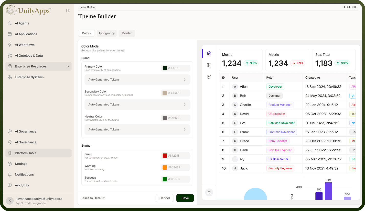
Settings › Theme Builder themes the platform UI itself — the builder workspace everyone in your org uses — so you can brand the UnifyApps environment with your colors and fonts. This is different from the Design System area, which manages the themes your applications use (see the Applications docs for that). Changes here don't touch any app's look; they change how the platform looks to your team.
Where: Settings › Theme Builder
Applying or undoing my changes
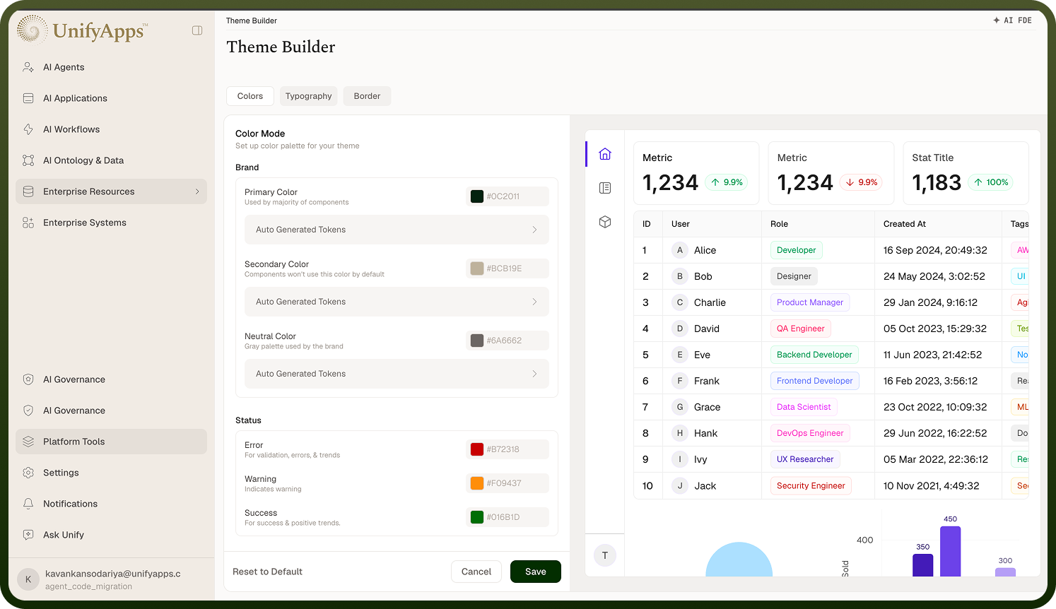
Three footer actions:
Save — publishes the updated platform theme; the new look applies immediately, for everyone.
Cancel — discards the edits you've made in this session without saving.
Reset to Default — removes the custom platform theme entirely and publishes the stock UnifyApps look.
Save and Reset to Default require edit permission on the theme builder — without it they're disabled and the screen is effectively read-only.
Where: Settings › Theme Builder, footer actions